
Colour Is Not Decoration: Jesmonite, Mid-Century Palettes and Restraint
Until this stage, the focus remained on structure, tolerance and material behaviour. Colour felt premature. The joins had not yet earned it.
Once workable moulds were established, deferring colour was no longer possible. Jesmonite integrates pigment into the body of the material. Colour is not applied — it is embedded. Any decision made here would affect weight, presence and perception.
Colour as Material Behaviour
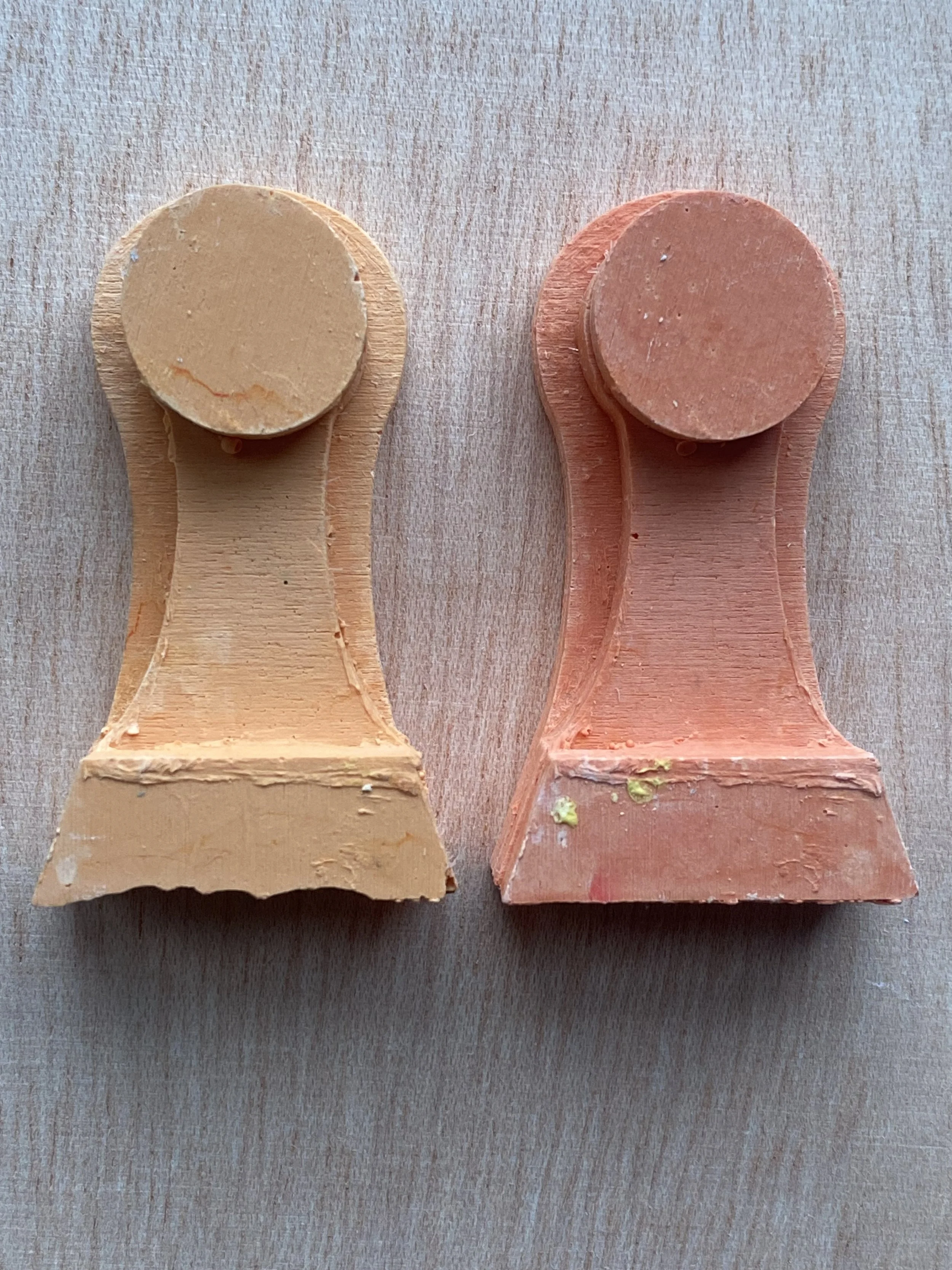
Jesmonite pigment does not behave like paint. Small variations in ratio noticeably shift the perceived density and seriousness of a cast. Too much pigment flattens form. Too little drains it of presence.
Early tests made this clear. Colour could not be intuitive or decorative. It had to reinforce structure.
Rather than selecting tones through preference, I returned to research.
1960s Palettes as Context, Not Nostalgia
The furniture and architectural research grounding this project pointed toward mid-century palettes — not for retro effect, but for material compatibility.
Ochres, deep greens, muted oranges and pale neutrals recur in catalogues, architectural finishes and signage of the period. These colours sit comfortably alongside concrete, timber and stone. They introduce warmth without softness and restraint without neutrality.
For this project, colour operates as context. It supports structural clarity and architectural sensibility rather than competing with it.

Mixing With Restraint
Colour tests were conducted by pre-mixing pigments into the liquid component of Jesmonite before adding powder. This allowed for controlled adjustments and repeatability. Even so, many mixes were rejected.
Some colours flattened form. Others introduced an unintended decorative quality that undermined the structural clarity of the joins. The most successful tests were often the least assertive, allowing shadow, edge and geometry to remain dominant.
These decisions were slow and deliberate. Colour was treated as something to be earned.
Colour and Perceived Weight
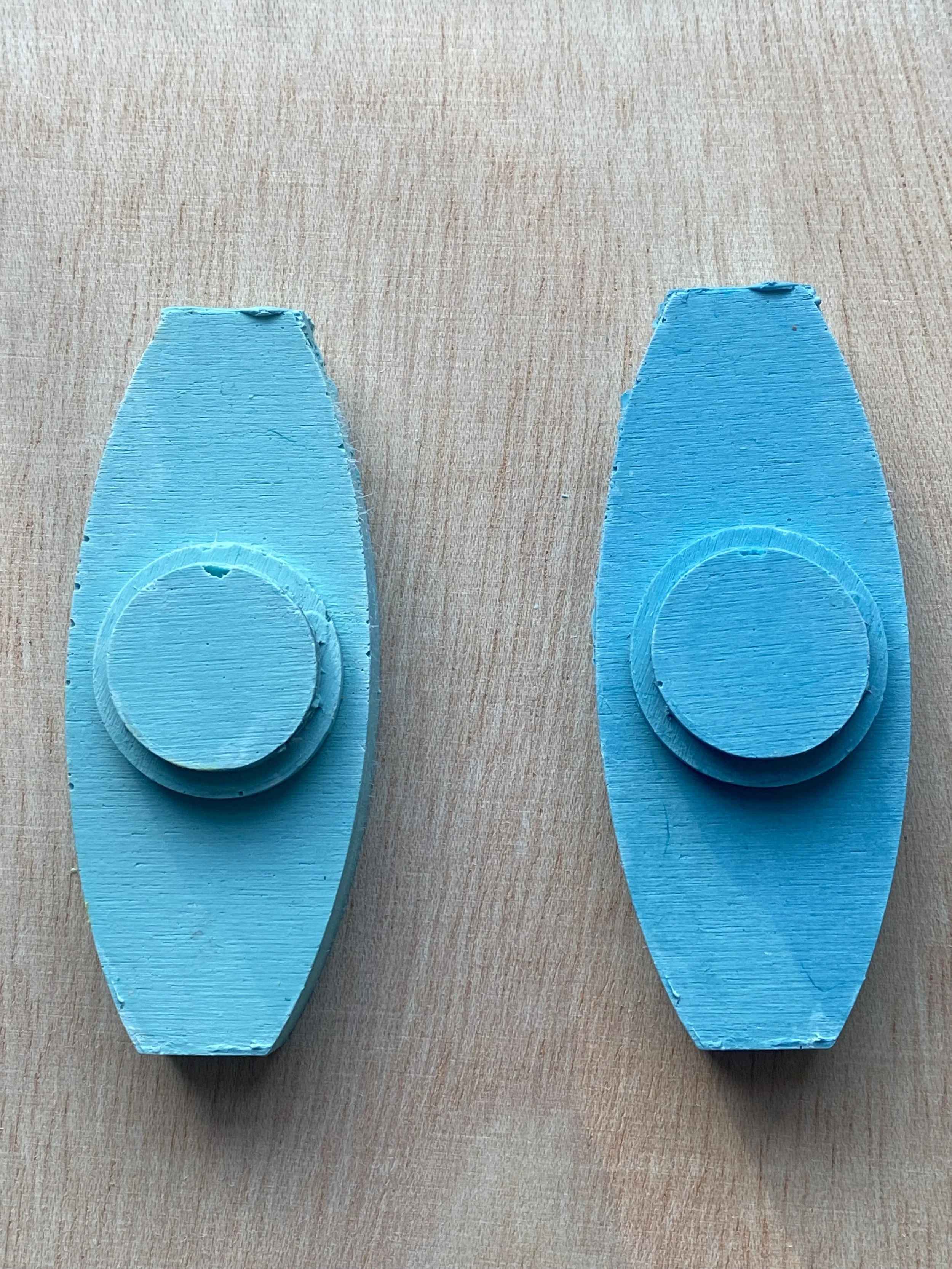
Colour significantly altered perceived mass. Darker tones increased the apparent gravity of a join, while lighter tones sharpened geometry and emphasised edge.
This relationship became a design tool. Colour could ground a form or allow it to recede, depending on how the join functioned within a larger configuration. Weight was no longer only physical; it was perceptual.
What This Stage Clarified
Working through colour in this way clarified that:
Jesmonite pigment demands discipline
restraint strengthens structural legibility
historical palettes offer context without prescribing outcomes
colour alters how joins are read spatially and emotionally
These constraints did not reduce possibility. They sharpened decision-making.
Setting Up Casting and Surface Testing
With a limited, deliberate palette established, the project returned to casting. The next phase would test how colour interacts with surface finish, texture and material density across Jesmonite and concrete.
Colour was no longer an afterthought. It was integrated into the system.